PayPal App Redesign
Onboarding Experience:
Account Setup & Upsell
A redesign of the onboarding journey for PayPal aimed at increasing successful account setup and product adoption. By simplifying the setup flow and introducing clearer guidance for actions such as profile completion, linking financial instruments, and discovering services like PayPal Debit Card and PayPal+
At A Glance
Team
Creative Director
Design Director
Product Designer(me)
Experience Strategist
Senior Producer
My Role
Experience Audit
Journey Mappping
Competitor Analysis
User Flow
Concept Development
Wireframes
Prototypes
Timeline
July-August/2025


Problem
PayPal’s new user in-app 30-day activation rate is currently 15–19%, significantly lower than competitors like Cash App and Venmo.
81%
19%
PayPal US
38%
Venmo US
Fintech P2P Leader
Goals & Success Metrics
Primary Goal
Increase 7- day new user activation rate from ~19% to 27%.
Secondary Goal
Encourage adoption of one additional PayPal product within the first 30 days
Guardrail
Avoid significant drops in engagement with secondary products.
Research
We tried to understand the problem better by auditing current onboarding experience, analysing user data, writing user stories and looking at competitors cases studies
Take first pass at mapping linear, contextual onboarding user flows for top 4 user stories: Send money, Receive money, Checkout (XO), and Explore offers/reactivation
00/ User research
Activated user share
Activation product
33%
P2P Send
25.9%
P2P Receive
20%
Payout
17.8%
Checkout
01/ Current Experience Audit
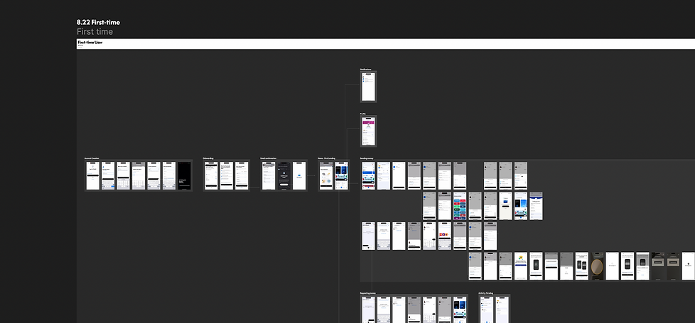

Current UX is cluttered with upsells that don’t align with first intent. Because of financial instrument not set up, users would fail to complete a transaction— their primary reason for downloading the app in the first place.
02/ Competitor Lanscape
looking at the onboarding landscape across financial products, what stood out to me was how different products balance friction, trust, and activation depending on their core use case.


CashApp: Ruthlessly simple onboarding UX — giving immediate path to the app surfaces. However access of moving money is gated until bank account is set up.

Robinhood: Onboarding is intentional, and focused. Third party authentication handles bank account setup which makes the setup smoother and trust worthy. Homescreen and certain features are locked until one task is completed(add fund).
03/ UX Pattern Takeaways


Research Insight
From reviewing the existing experience and user behavior patterns, a few insights stood out. The root cause is a lack of clarity and signal in the homepage experience, driven by the “super app” approach. New users are bombarded with too many irrelevant features before completing their first core transaction.
Onboarding is not guided towards completing users main tasks
Setup takes up cognitive load without intentional reward/incentives
Promotions were presented in the wrong moments
Problem framing
How might we make onboarding setup seamless and contextual while reducing cognitive load and distractions?
Proposed Solution
Progressive Onboarding
Design Principles
Prioritize “First Win” actions (e.g., send money, receive payout, complete XO).
Progressively introduces the user to the rest of the ecosystem only after activation.
Adapts dynamically based on user intent (Money In / Money Out / XO).
Incorporates profile completion, Financial instrument setup with clear incentives and “pick-up where you left off” logic.
Update User Flow
Rather than relying on a single rigid onboarding flow, I explored a more flexible system that supports users over time.
Remove upsells in the initial onboarding, making Financial Instrument Setup the priority without distractions. Make account setup progressive and contextual across tabs after first time landing to reduce cognitive load. Promote upsells contextually in a meaningful order after setup is completed.
.png)
Design Exploration 01
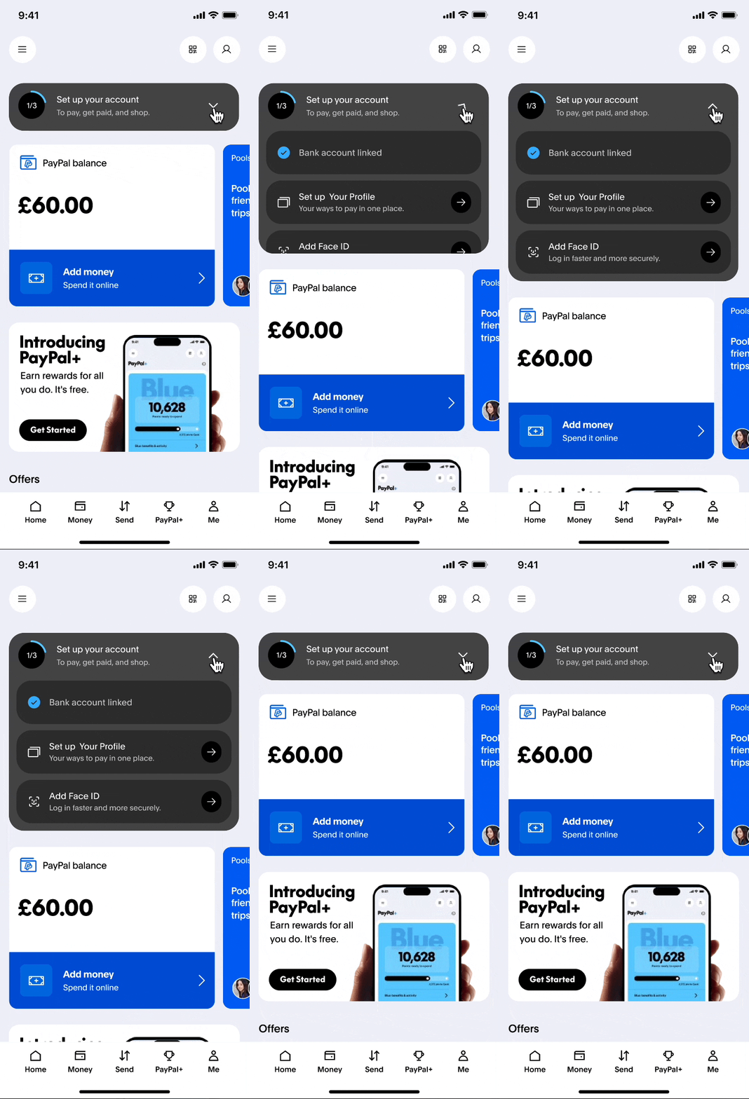
Homepage Persistent Setup
Collapsible Module - A1
Contains all setup status, expanded state pushes contents down


Pros:
- Contains most context and details for each step
Cons:
- Takes up most real estate when expanded
Collapsible Module - A2
Contains all setup status, expanded state floats on top of the screen


Pros:
- More visual guidance with icons
- Takes up least real estate when collapsed
Cons:
- Fewer details for each step
Collapsible Module - A3
Top collapsible module that contains setup step carousels


Pros:
- Collapsed state visually blends with current layout design
Cons:
- Fewer details for each step
- Steps carousel hidden behind the screen
Design Exploration 02
Homepage Floating Action Button(FAB)
Homepage FAB
Floating Action Button at the bottom

FAB - B1
Bottom modal accomodates all steps

Pros:
- Contains most context and details for each step
Cons:
- More cognitive load
FAB - B2
A series of coach marks across the tabs

Pros:
- Simple minimum UI for each step
- Least cognitive load
Cons:
- No direct CTA that links to setup
FAB - B3
A series of coach marks across the tabs

Pros:
- More details and status at each step
- Clear direct CTAs
Cons:
- Takes up more real estate
Design Exploration 03
Send Surface Financial Instrument(FI) Setup
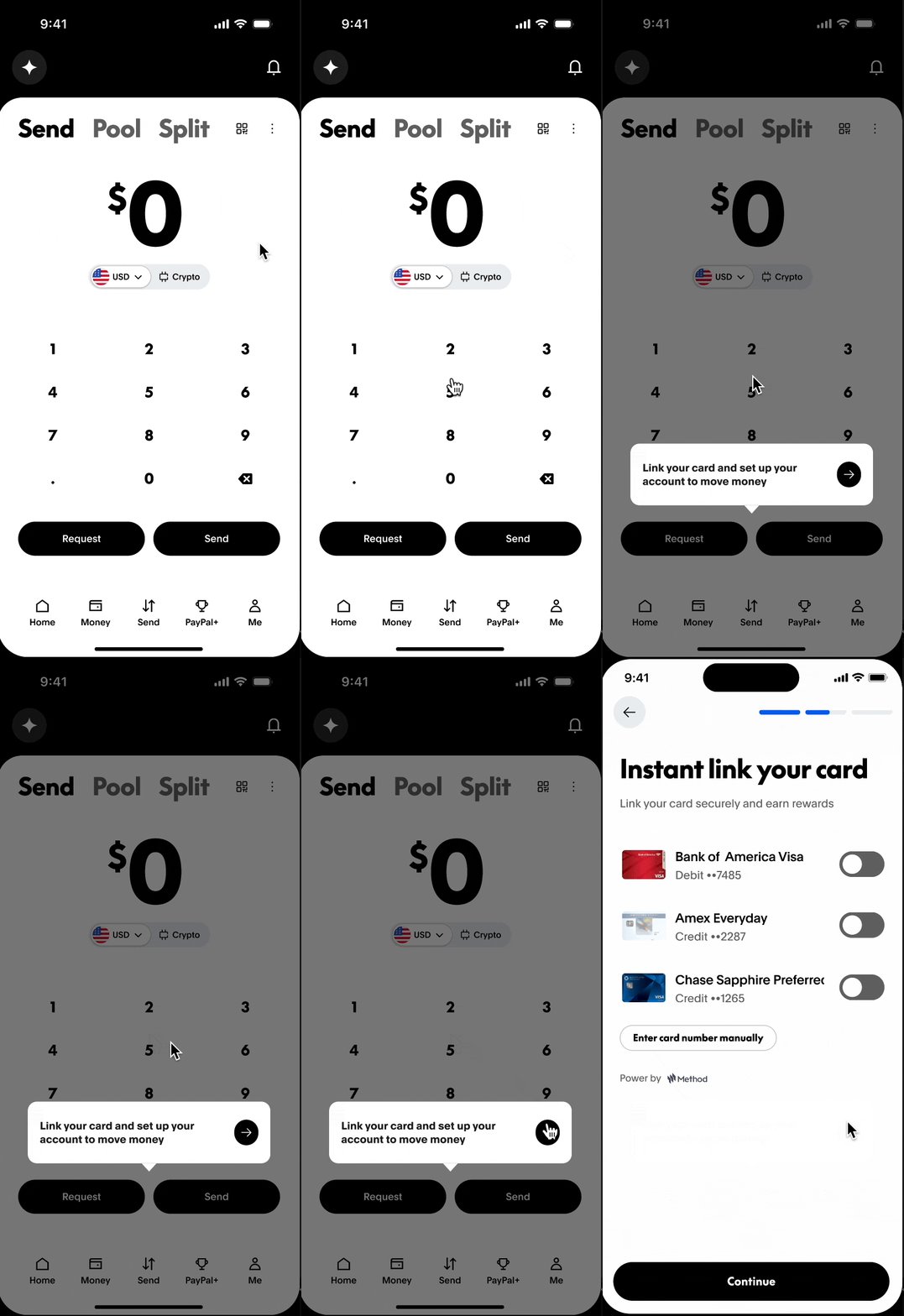
FI Setup Nudge - C1
Contextual FI setup when accessing 'Request' and 'Send'
.png)

Pros:
- Contextual FI setup when users try to access 'Request' and 'Send' functionality
- Users can close it anytime
Cons:
- Gives users illusion that the functionality is accessible before interactions
FI Setup Nudge - C2
Disable the 'Request' and 'Send' CTAs with a FAB persisting FI setup
.png)
Pros:
- Clear CTA
- More prominent and persistent
- Takes up minimum real estate
Cons:
- Will be present and can't be removed until setup completed, potentially adding stress
FI Setup Nudge - C3
Bottom modal displaying all setup steps status

Pros:
- More real estate to show more details and users' current setup progress
Cons:
- Other setup sections shown at the same space could cause unnecessary confusion
- need extra navigation
Design Exploration 04
PayPal+ Upsell Journey
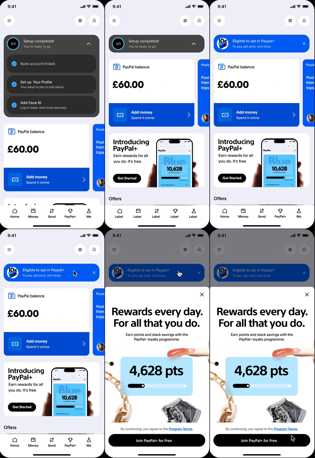
Only promote PP+ after users complete account setup utilising the same sticky module for visual consistency
.png)
Design Exploration 05
PayPal Debit Card Upsell &
Persist Incomplete Setup
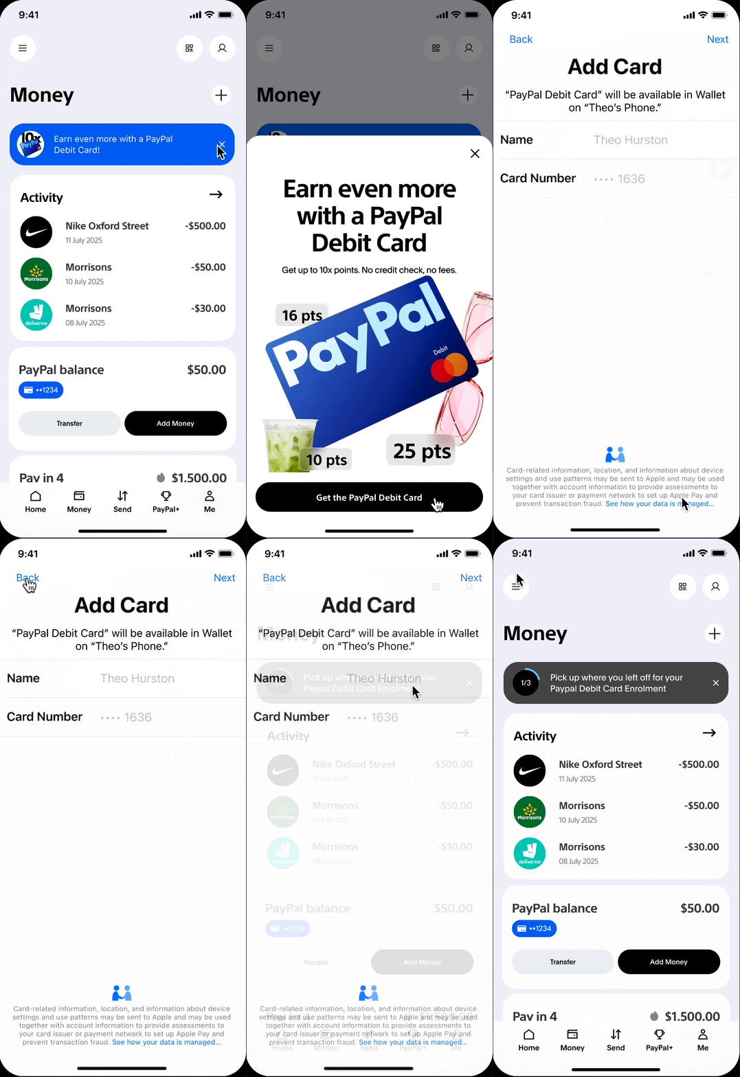
If users already has PP+, promote PPDC contextually on the 'Send' surface with incentives when users send money.
If users opt in PPDC sign-up but drop out halfway, a sticky nudge on 'Money' surface will persist the setup, after the setup the sticky module will become PP+ upsell.
.png)
Final Design Prototype
Homepage
Persistent account setup entry point
Profile Page
Persistent onboarding entry point on Profile page

Sned Page
Contextual FI set up prompt on Send page
Homepage
Contextual PP+ upsell aligned with setup state
Money page
Contextual PPDC upsell aligned with setup state
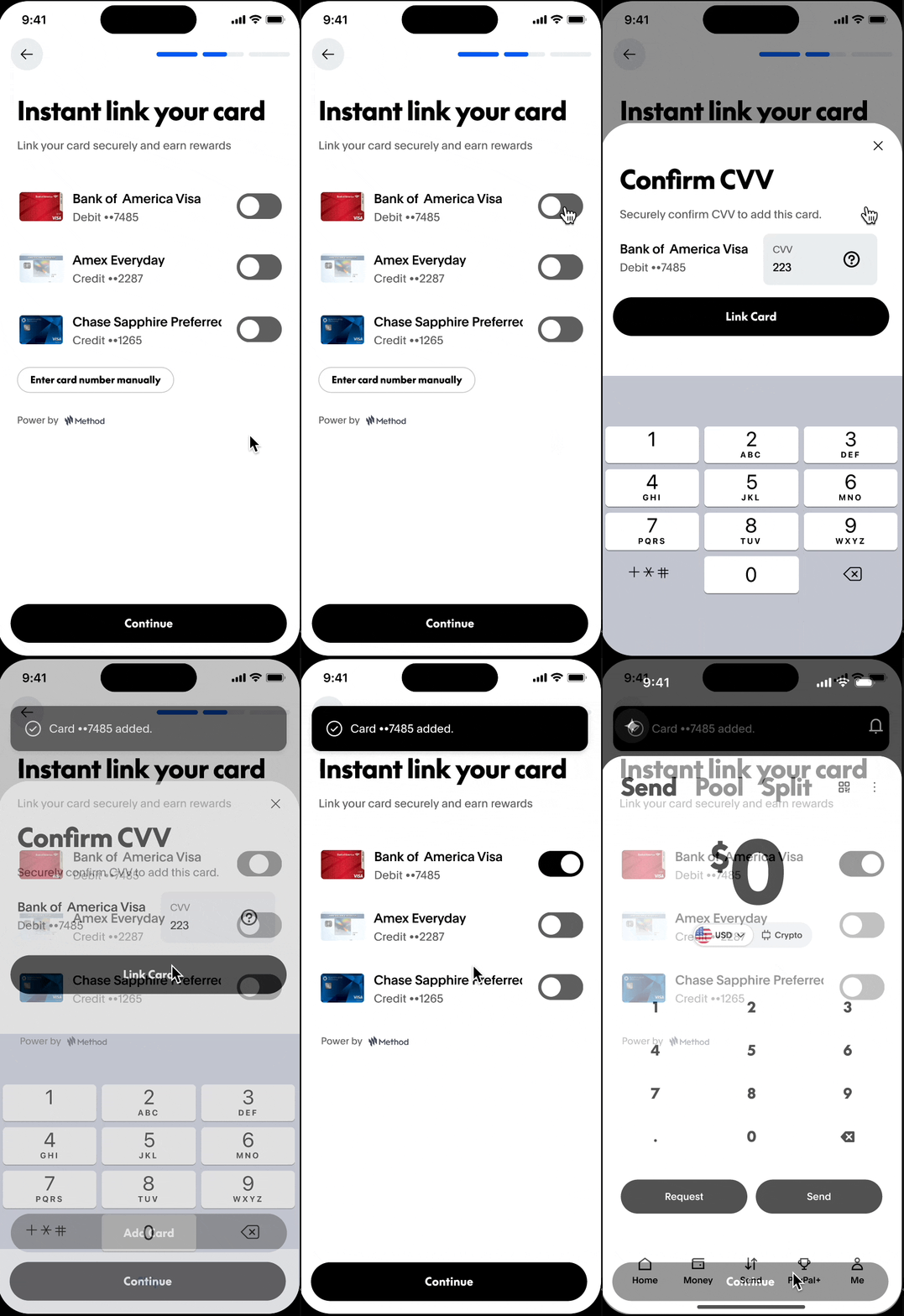
FI Setup
Easy one click FI setup with third party Auth


Takeaways
What did I learn?
Reducing friction is as much about timing as simplification
I learned that reducing friction isn’t just about removing steps, but about presenting the right information at the right moment.
Onboarding is not a single flow, but an ongoing system
It shouldn’t be treated as a one-time linear flow, but as a system that supports users over time—especially when they drop off and return.
Design and navigate the project with ambiguity
When product requirements are not as clear as we expect, we need to account for potential unforeseen cases and design scalable solution
In the hindsight
What can I do better next?
Dive deeper on user intent, user stories and incentives
Given more time, I’d explore how to tailor steps depending on whether users are here to send money, finish checkout, shop, or just explore.
Validate with real user behavior
One thing I would push further is validating these decisions with real user testing—particularly around whether multiple entry points create clarity or confusion.
Try not to over-diverge in the wires exploration stage
Effective exploration is about generating meaningful variations, not just volume.
Overall, this project shifted how I think about onboarding—from a flow to a system that evolves with the user, which is something I’m really interested in developing further.